Size and padding
Text
border-radius: 8px;
height: 48px;
width: depending on content;
min width: 144px;
padding: 12px 32px;
height: 48px;
width: depending on content;
min width: 144px;
padding: 12px 32px;
weight: bold;
font-size: 15px;
color: #FFFFFF;
text-align: center;
line-height: 24px;
font-size: 15px;
color: #FFFFFF;
text-align: center;
line-height: 24px;
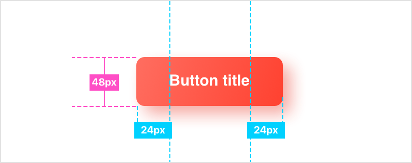
Specification
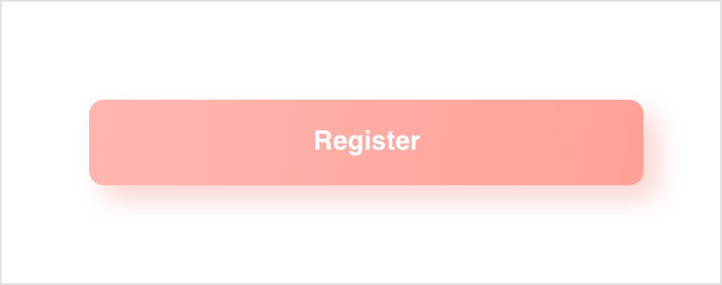
Disabled
opacity: 0.5;
text-color: #FFFFFF;
background: linear-gradient(134deg, #FF6D60 0%, #FF4130 100%);
box-shadow: 8px 8px 16px 0 rgba(233,43,26,0.40);
text-color: #FFFFFF;
background: linear-gradient(134deg, #FF6D60 0%, #FF4130 100%);
box-shadow: 8px 8px 16px 0 rgba(233,43,26,0.40);
Pressed
background-gradient: (-45deg, #DF2311 0%, #FF4130 100%);
box-shadow: 8px 8px 16px 0 rgba(233,43,26,0.20);
box-shadow: 8px 8px 16px 0 rgba(233,43,26,0.20);

gradient opacity:
0%
100%
0%
linear
scale:
100%
105%
100%
ease-in-out
0ms
150ms
450ms
Animation
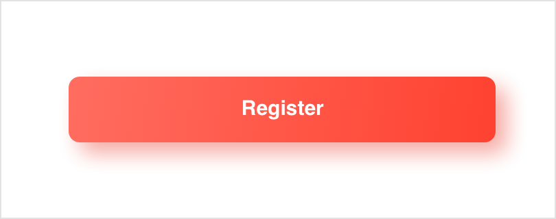
Normal
background: linear-gradient(134deg, #FF6D60 0%, #FF4130 100%);
box-shadow: 8px 8px 16px 0 rgba(233,43,26,0.40);
box-shadow: 8px 8px 16px 0 rgba(233,43,26,0.40);
States
Filled primary button
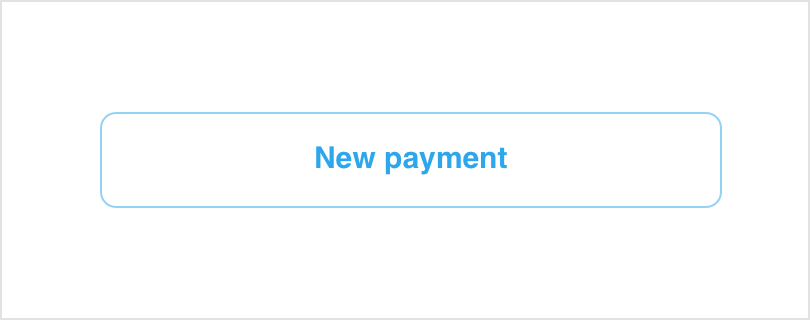
Size and padding
Text
border-radius: 8px;
height: 48px;
width: depending on content;
min width: 144px;
padding: 12px 32px;
height: 48px;
width: depending on content;
min width: 144px;
padding: 12px 32px;
weight: bold;
font-size: 15px;
color: #2DA6EC;
text-align: center;
line-height: 24px;
font-size: 15px;
color: #2DA6EC;
text-align: center;
line-height: 24px;
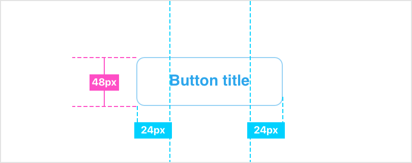
Specification
Disabled
opacity: 0.5;
text-color: #2DA6EC;
opacity: 0.5;
border: 1px solid #2DA6EC;
text-color: #2DA6EC;
opacity: 0.5;
border: 1px solid #2DA6EC;

Pressed
background: #2DA6EC;
text-color: #FFFFFF;
text-color: #FFFFFF;

Normal
opacity: 0.5;
border: 1px solid #2DA6EC;
border: 1px solid #2DA6EC;
States
Stroke secondary button