Can be used inline because they are different from content in style and recognizable as buttons alongside
content.
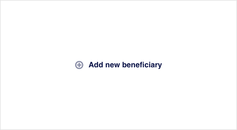
Stroke tertiary button
Used to indicate an additional non-mandatory action in details screens and bottom sheets.
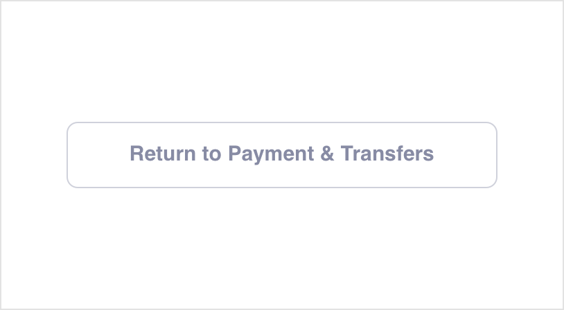
Stroke secondary button
Used to indicate a secondary action or to choose one of multiple suggested options.
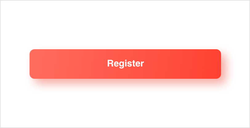
Filled primary button
Used to direct the user's attention to the primary action to take in app screens.
Usage